
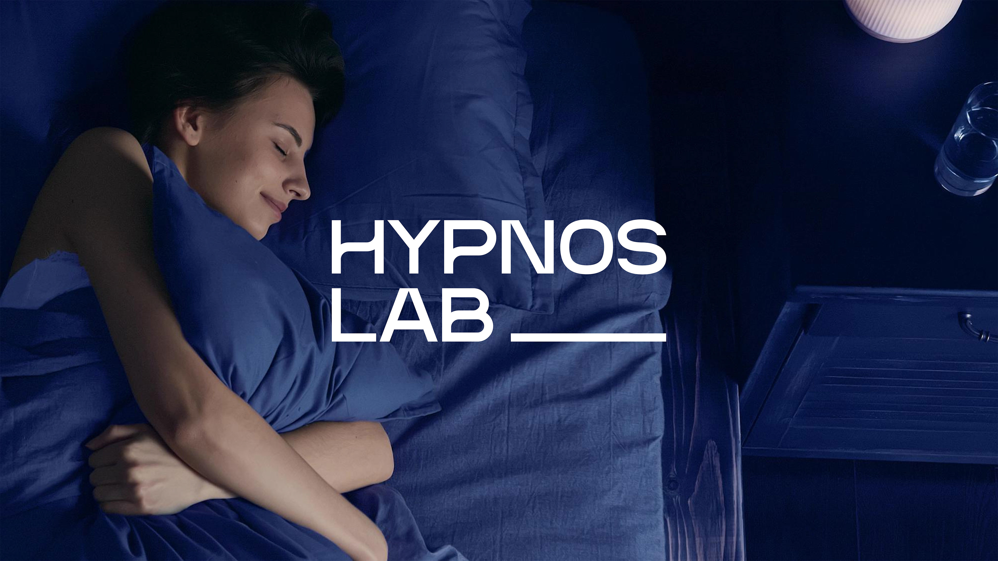
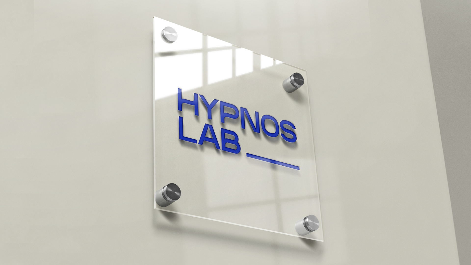
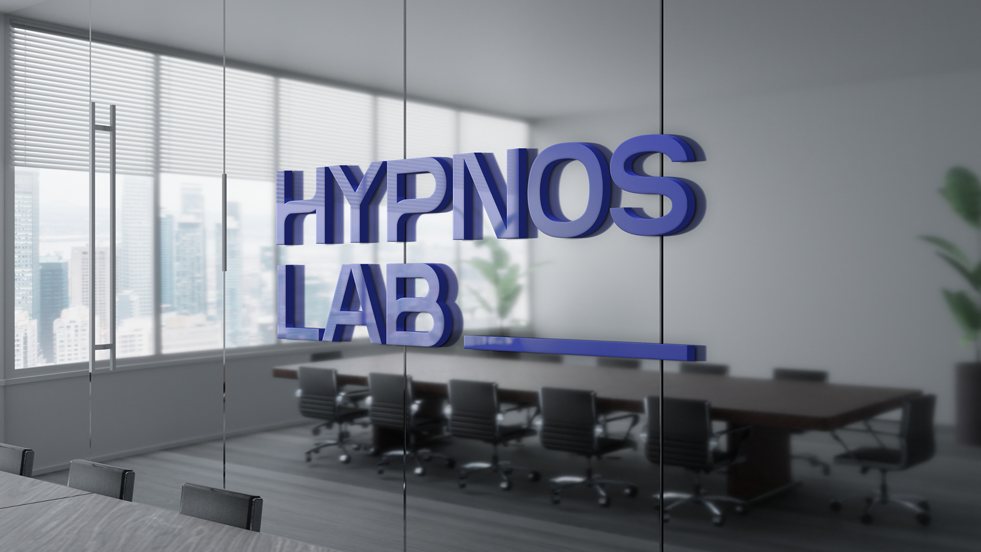
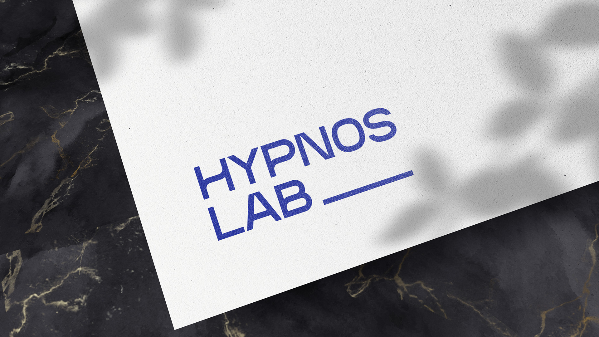
The challenge was to create a brand identity that felt solid, technical, and trustworthy, while still connected to the human side of sleep, wellbeing, and prevention. The visual solution was built around a clean, geometric all-type logo, combining straight lines with subtle curves to balance precision and care.
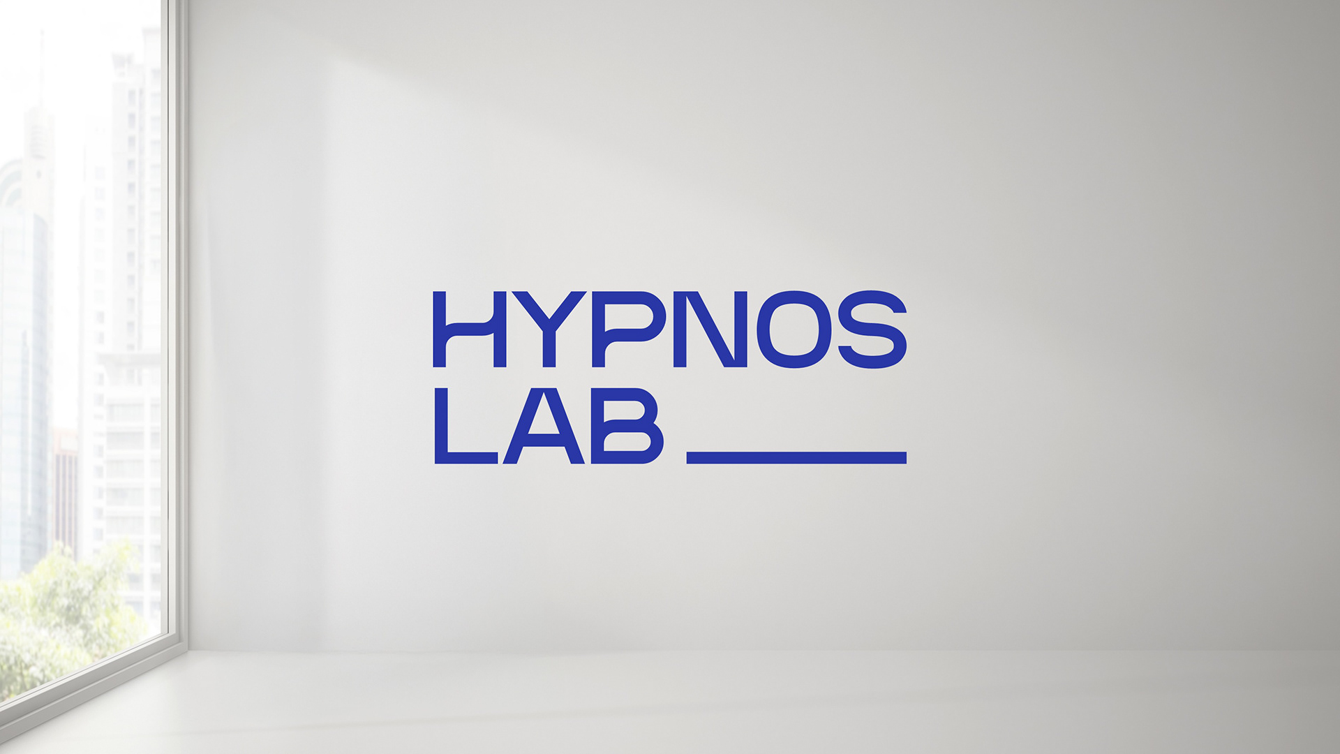
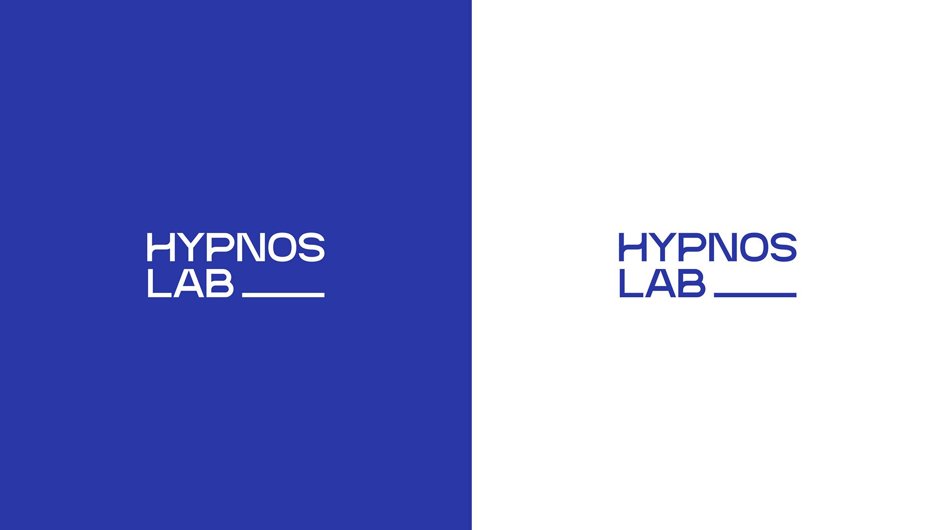
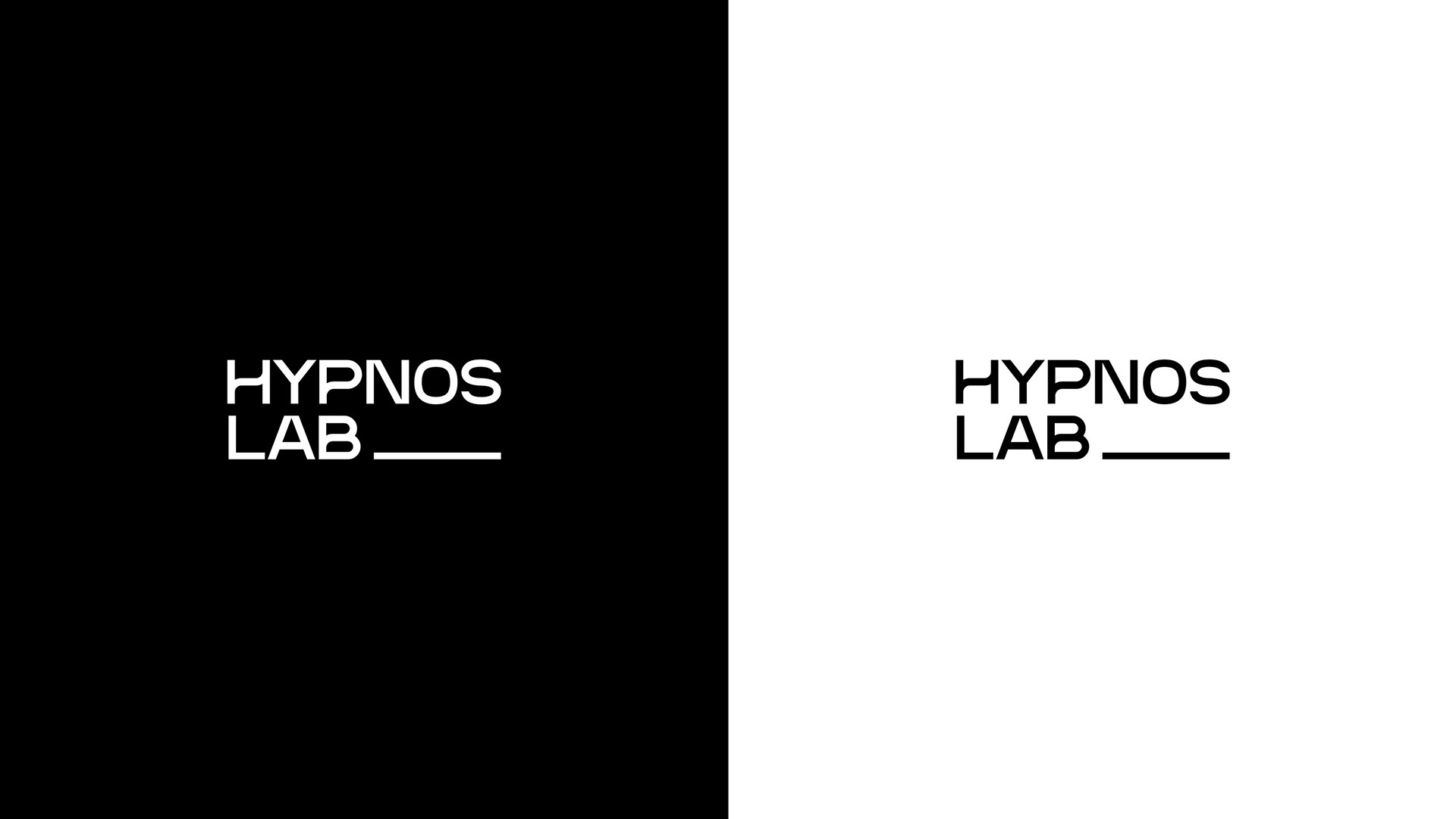
The main concept behind the identity is a continuous line, inspired by sleep tracking patterns and the visual idea of a long, stable sleep cycle. This extended underline becomes the key graphic gesture of the brand, symbolizing consistency, quality sleep, and the importance of longer restorative rest.
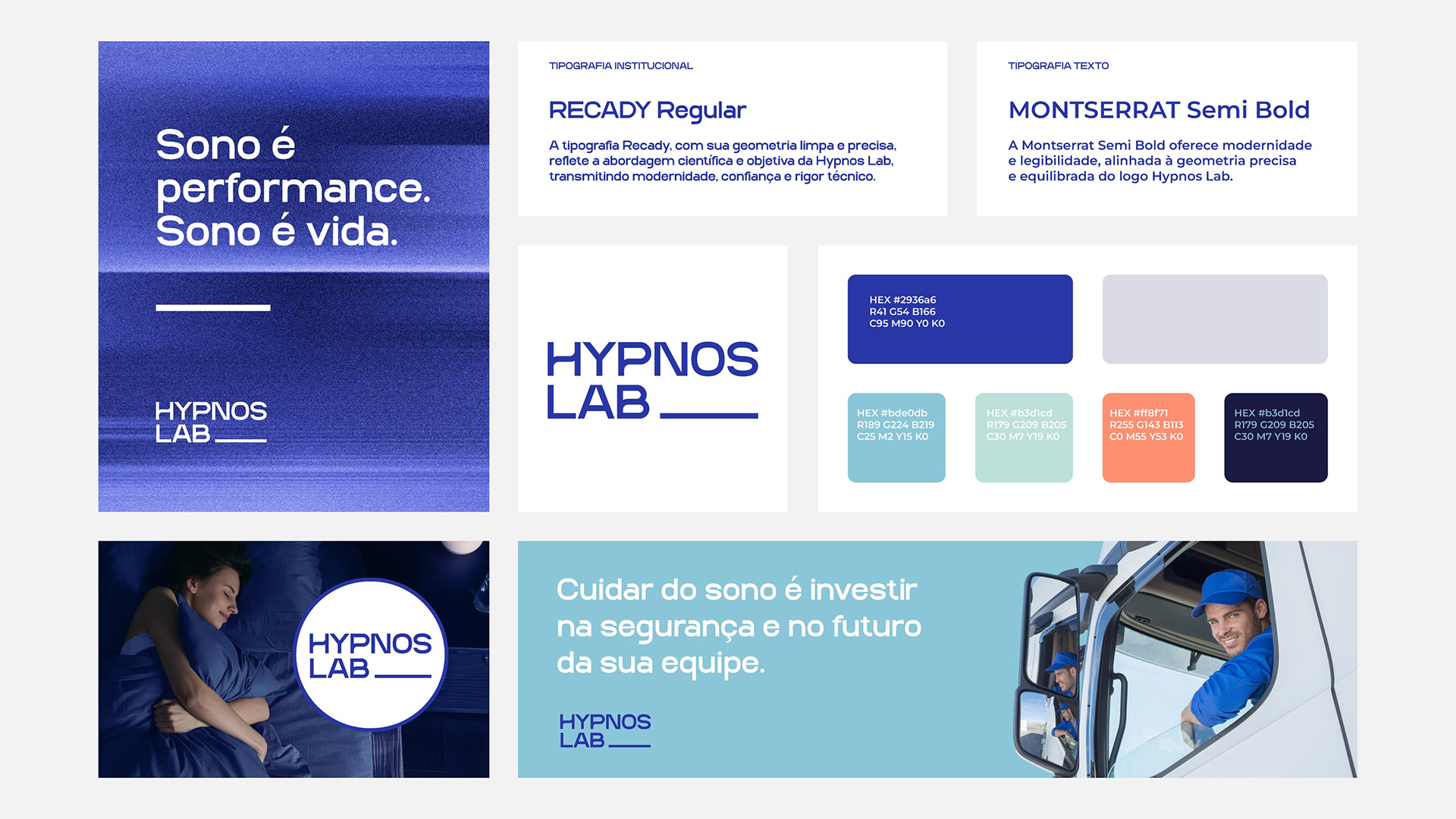
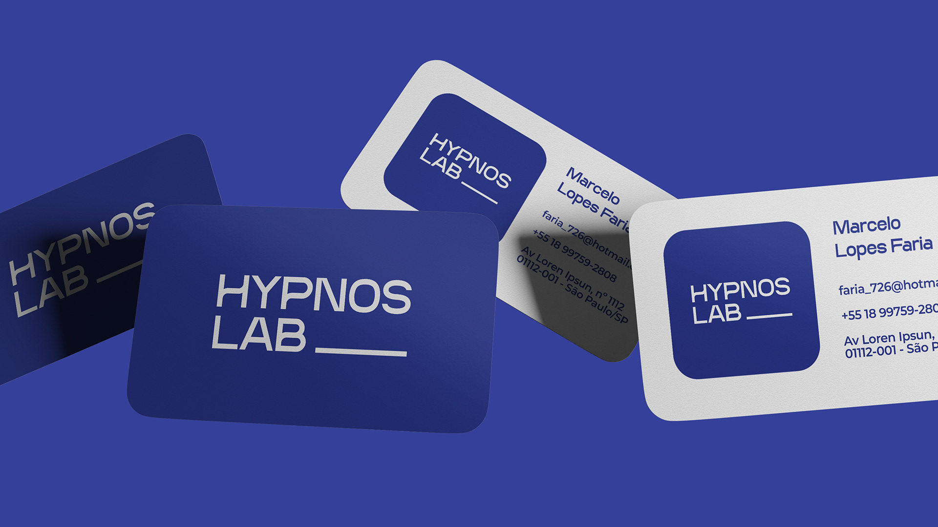
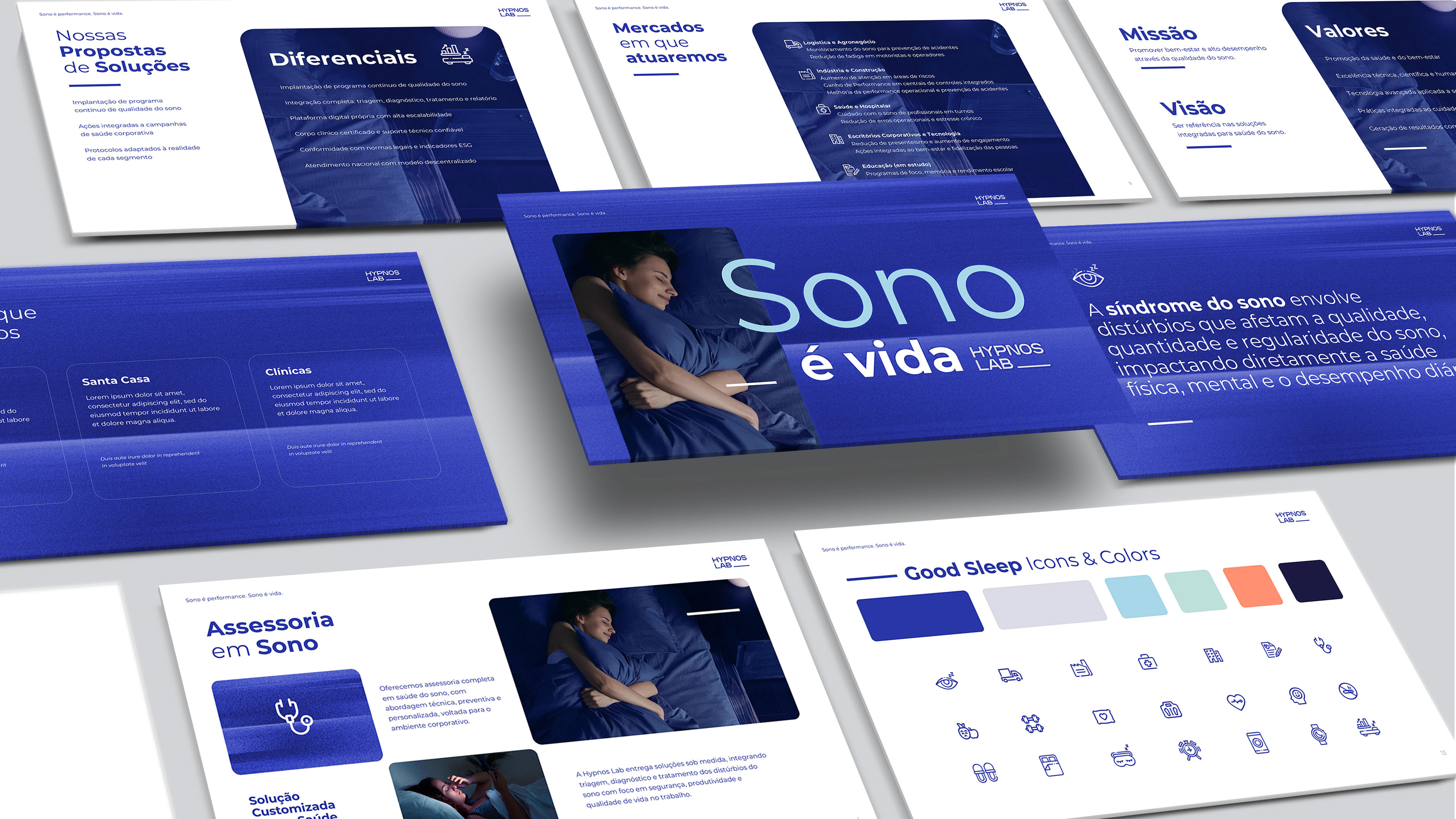
The result is a visual identity with a medical-laboratory feel, but without becoming cold or generic. A brand designed to communicate science, safety, prevention, and better quality of life inside companies.
Thanks for watching!