

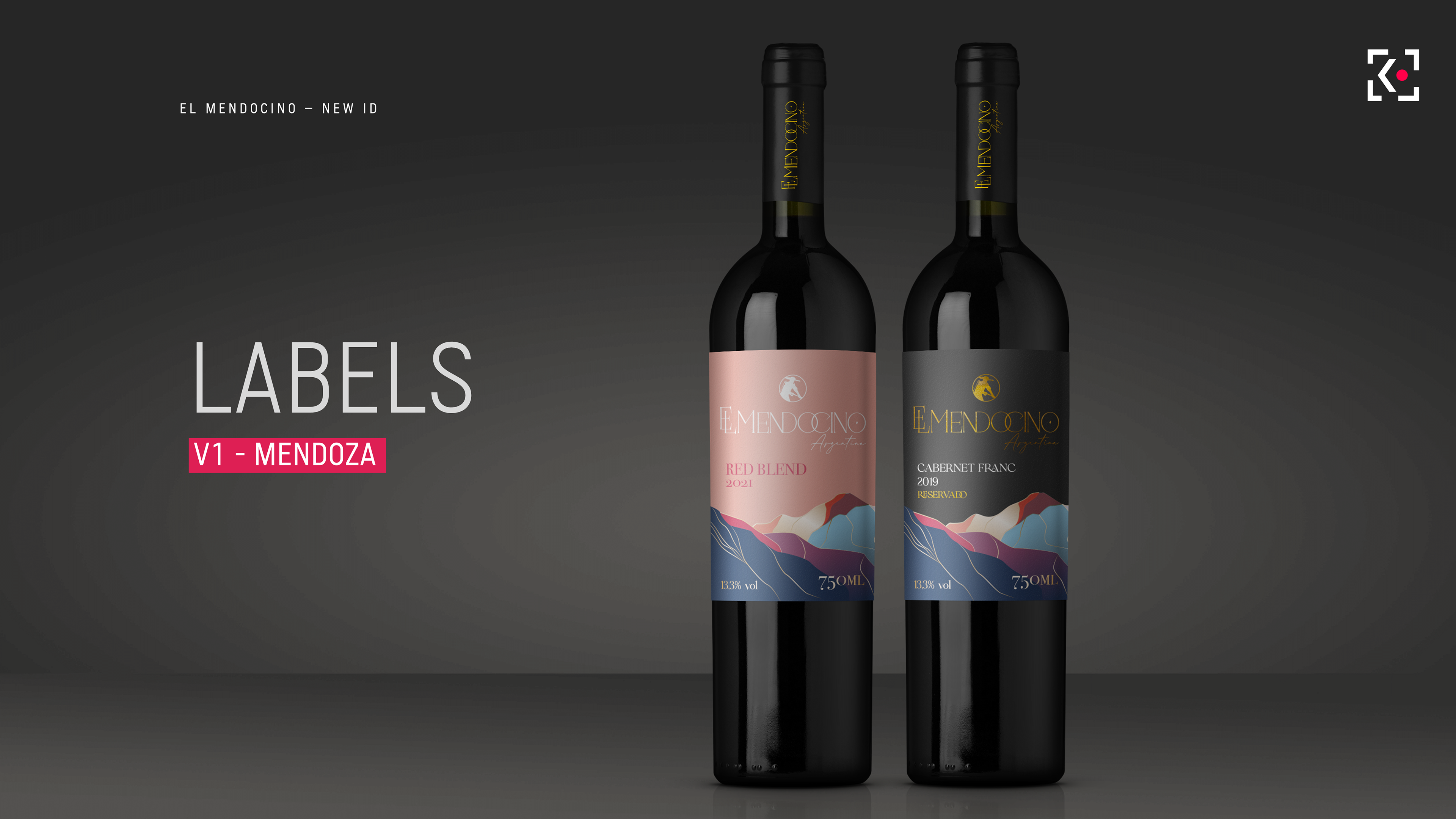
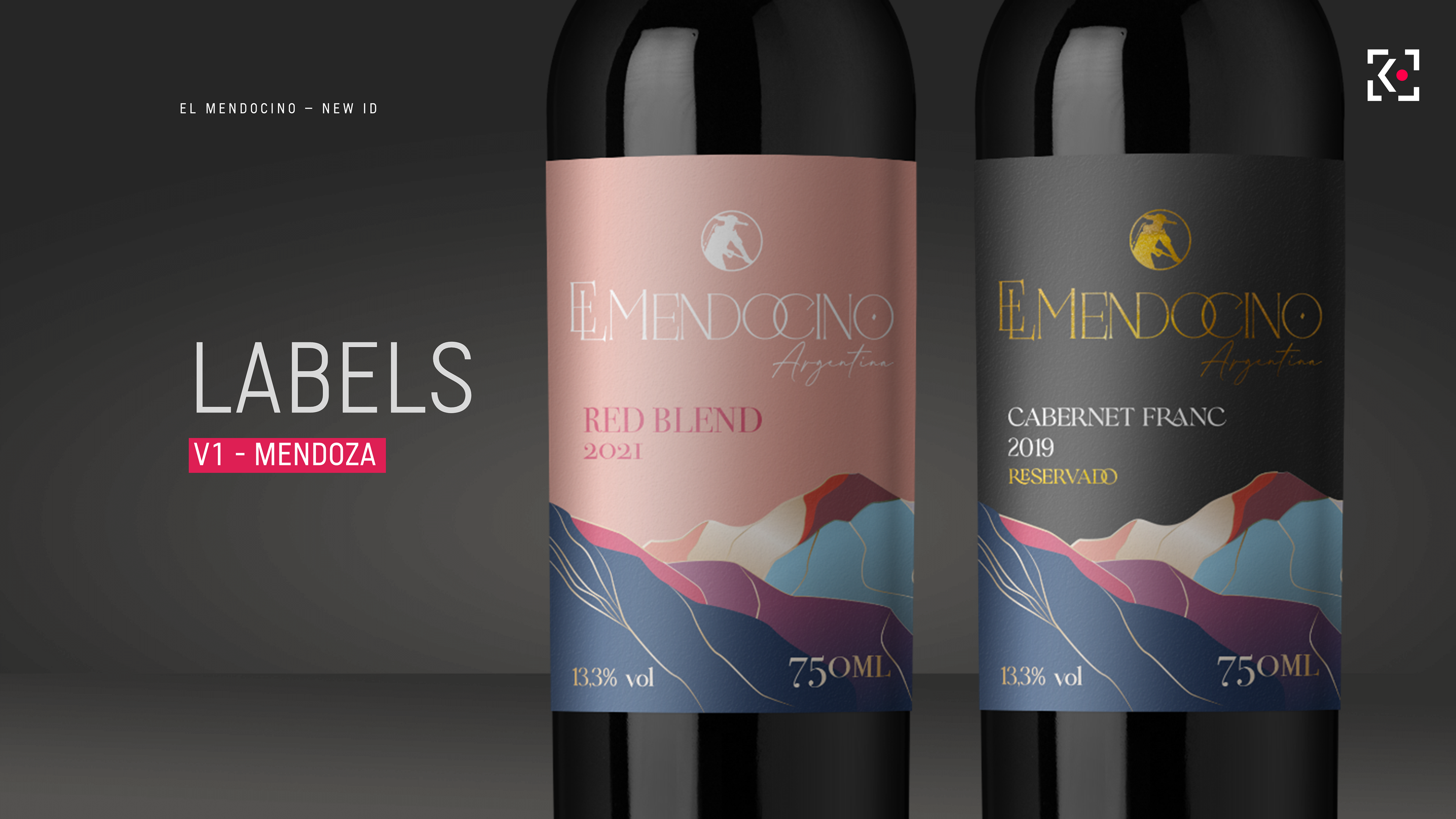
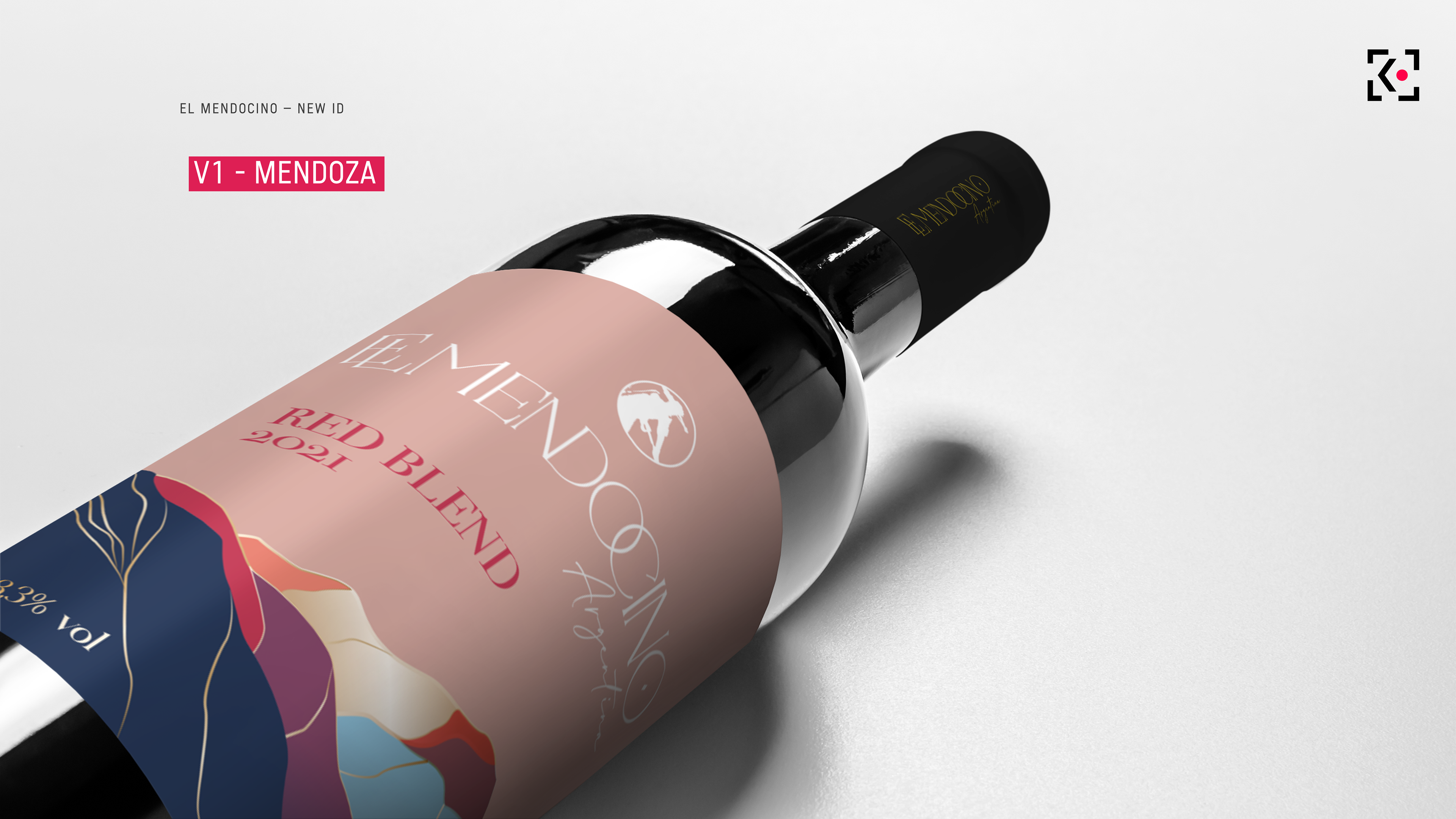
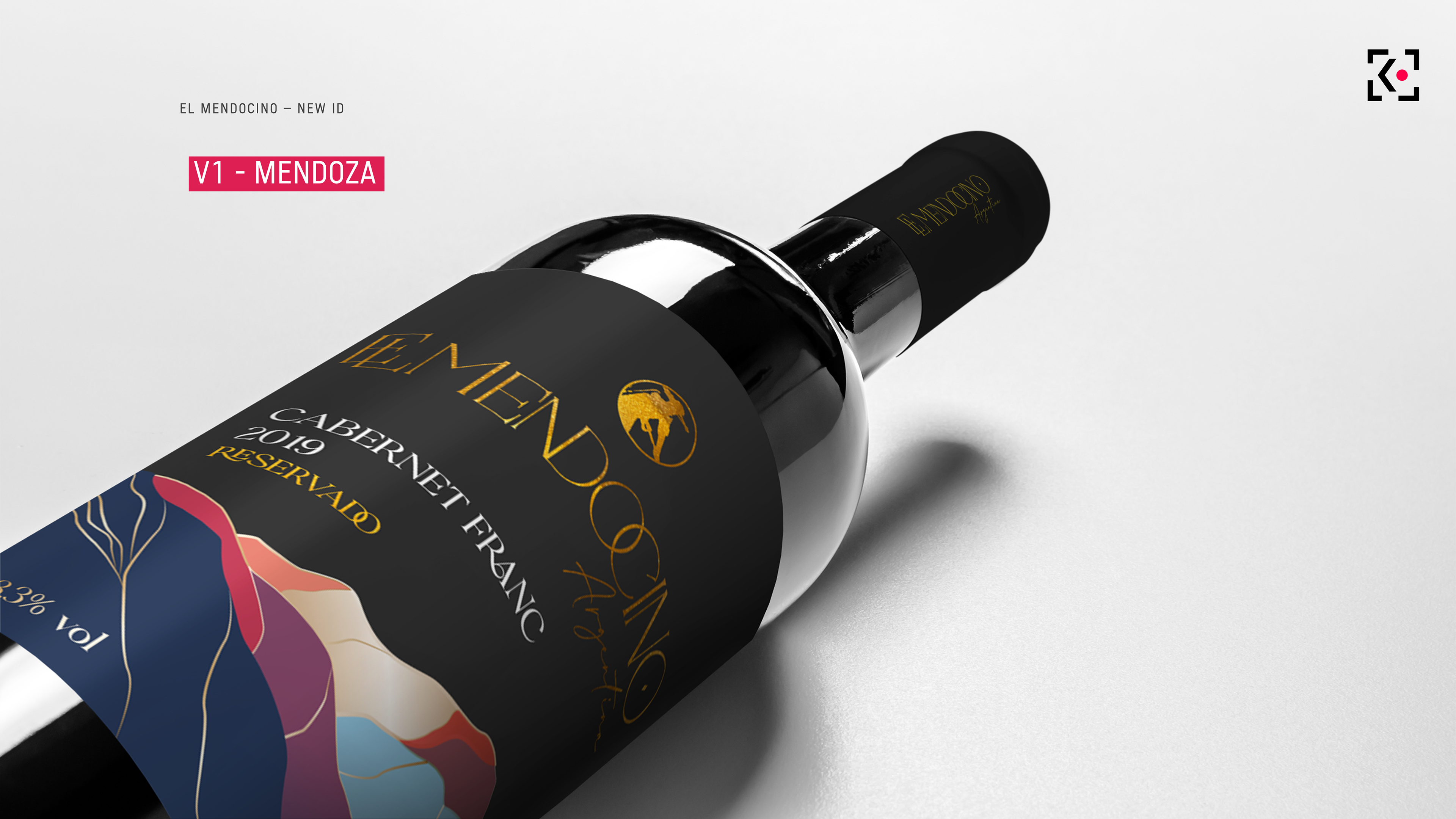
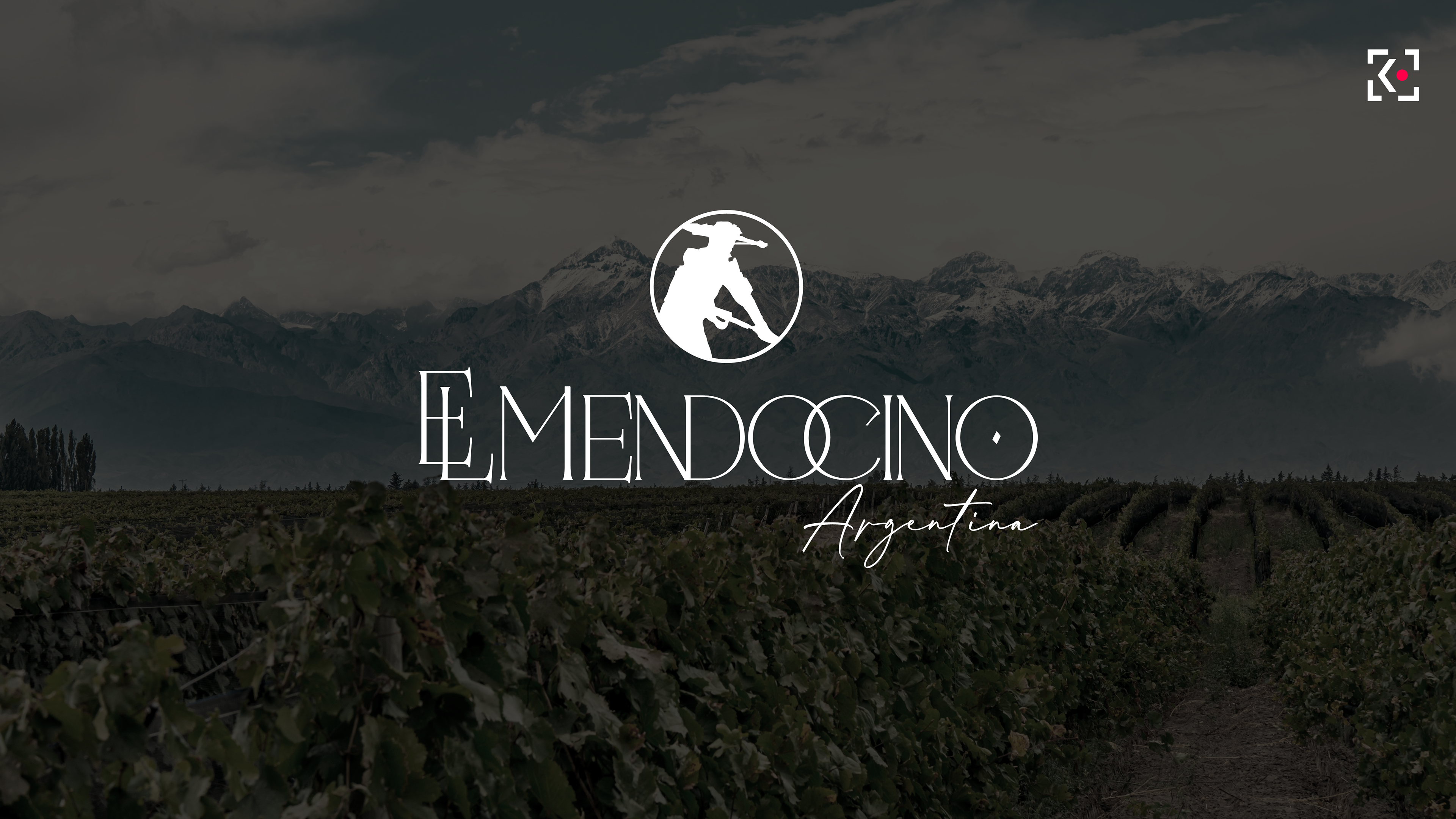
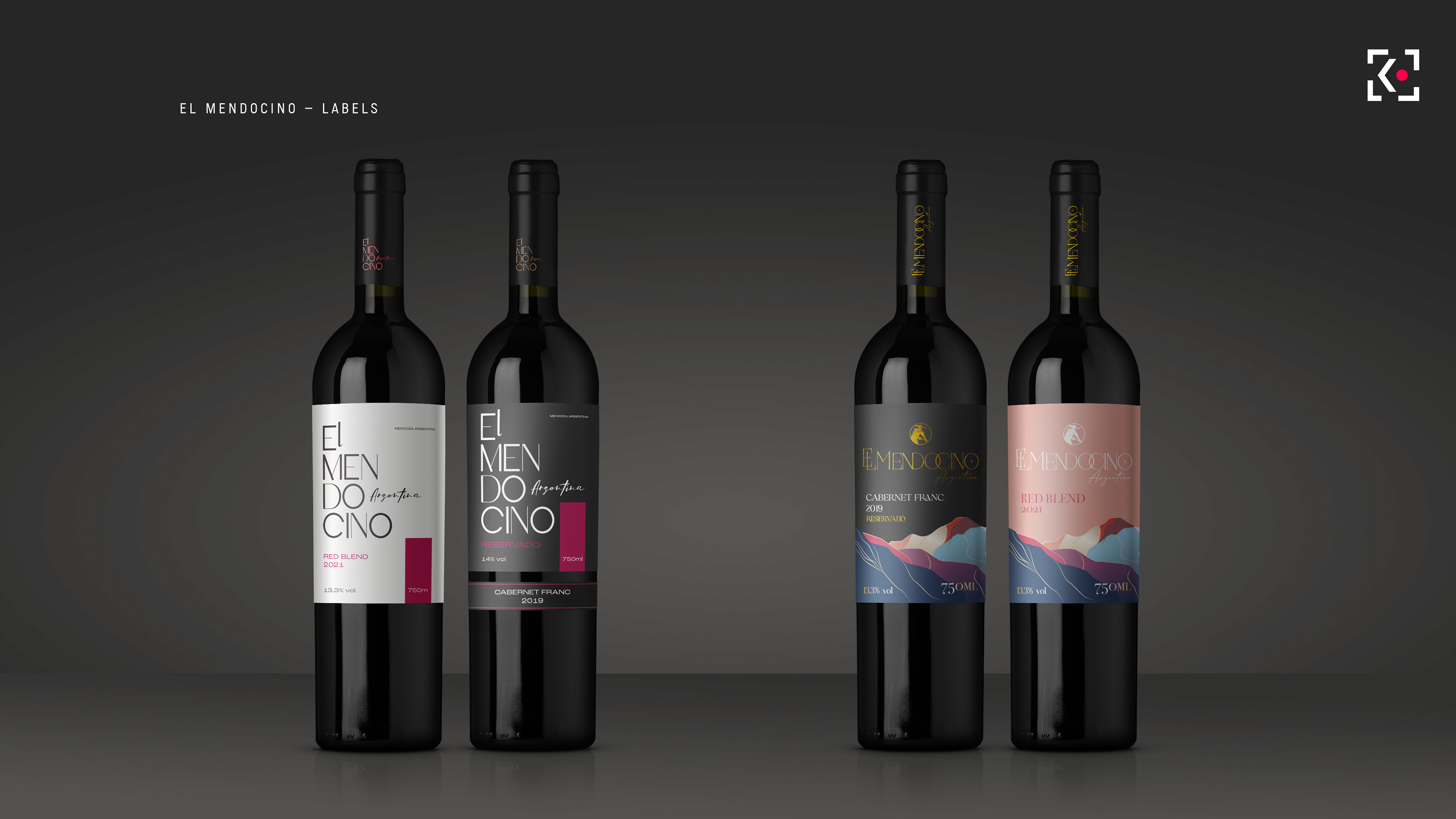
The work explored two different brand expressions: a more classic and colorful route, with foil stamping and a new icon derived from the original logo illustration.
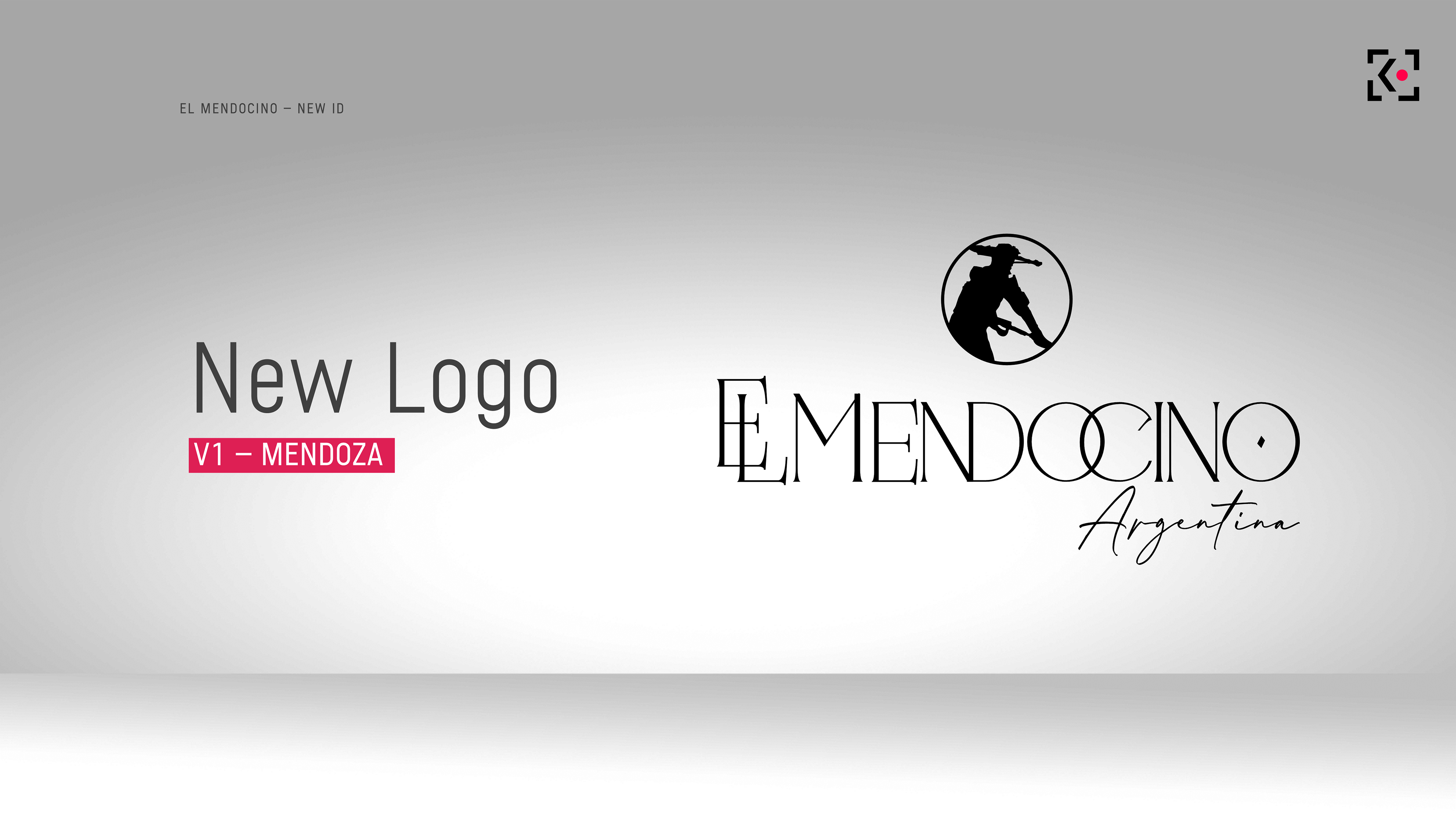
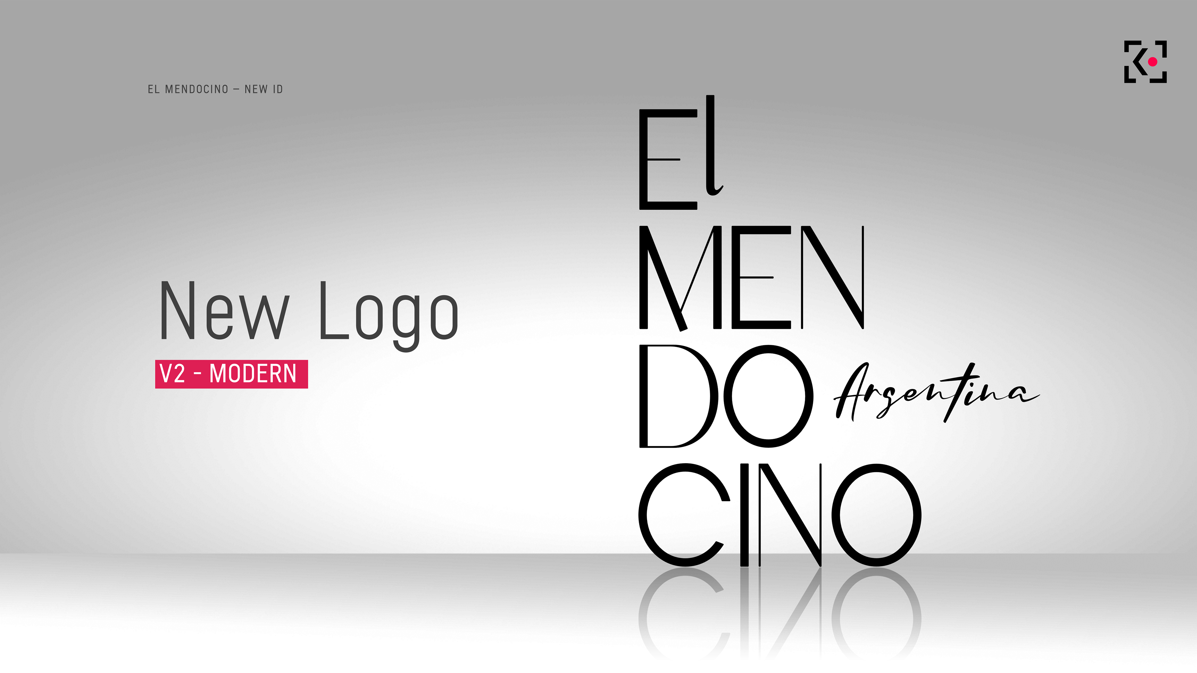
The second version is minimal, contemporary, built with a restrained black,
white and red palette.
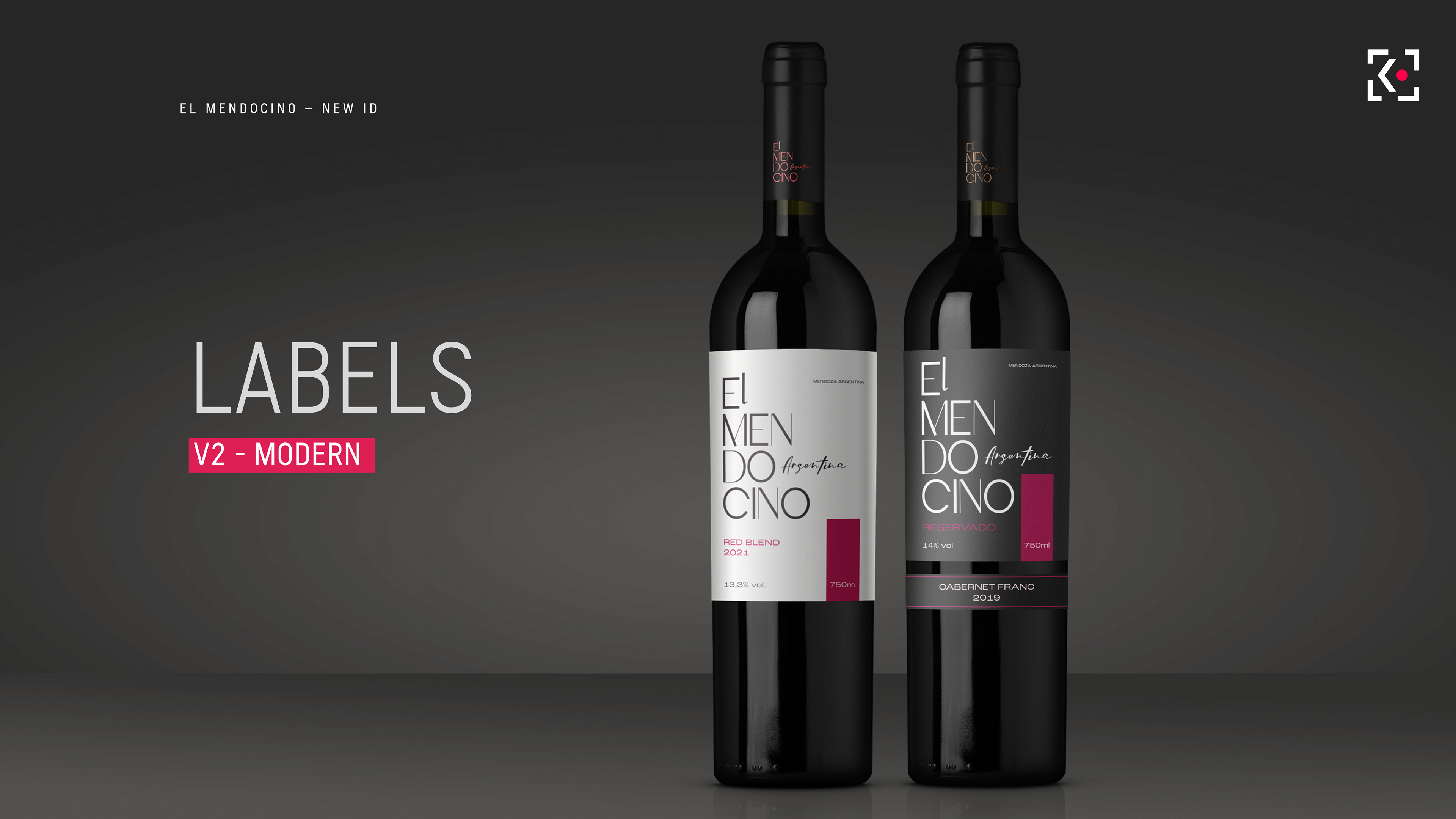
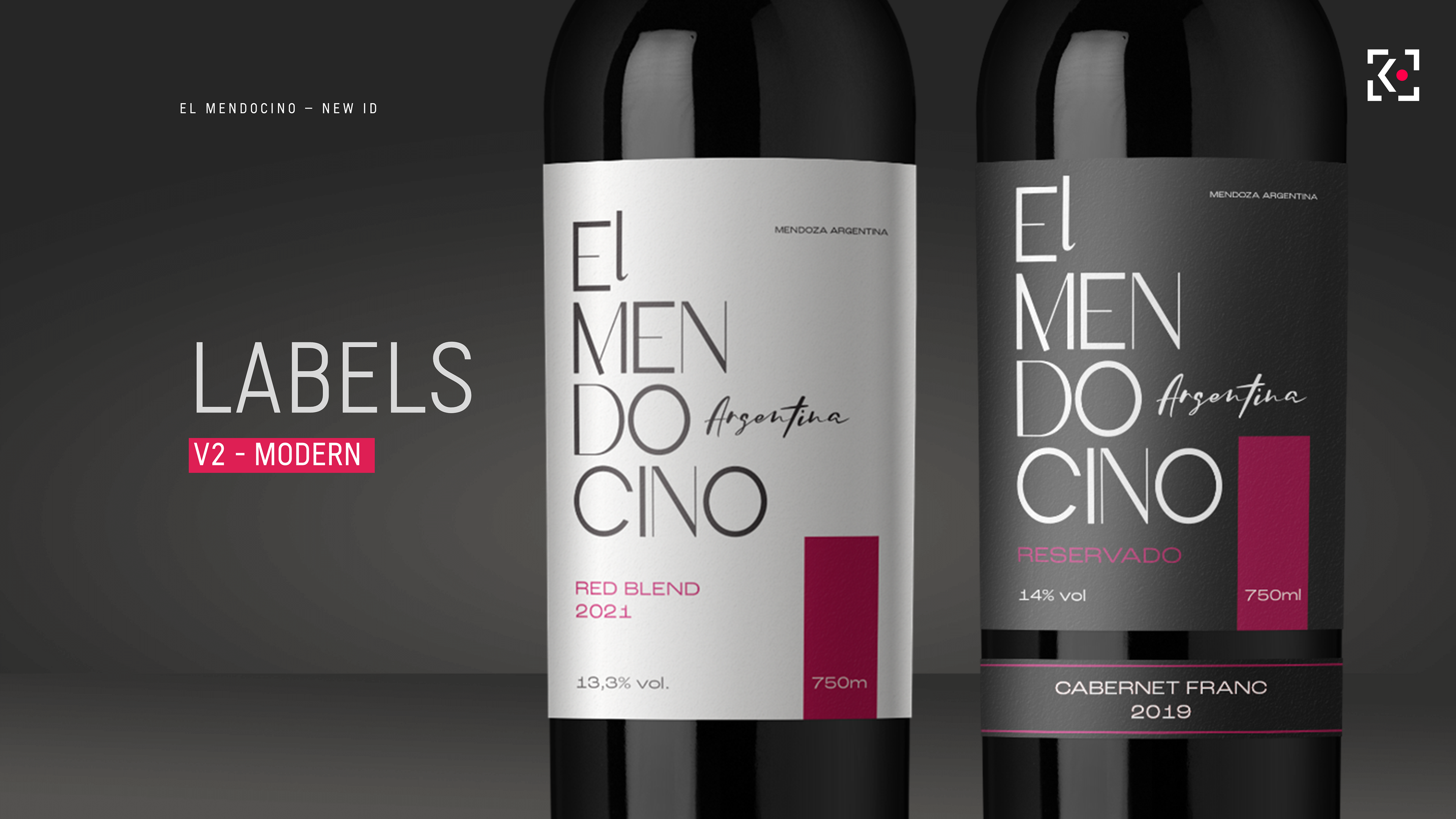
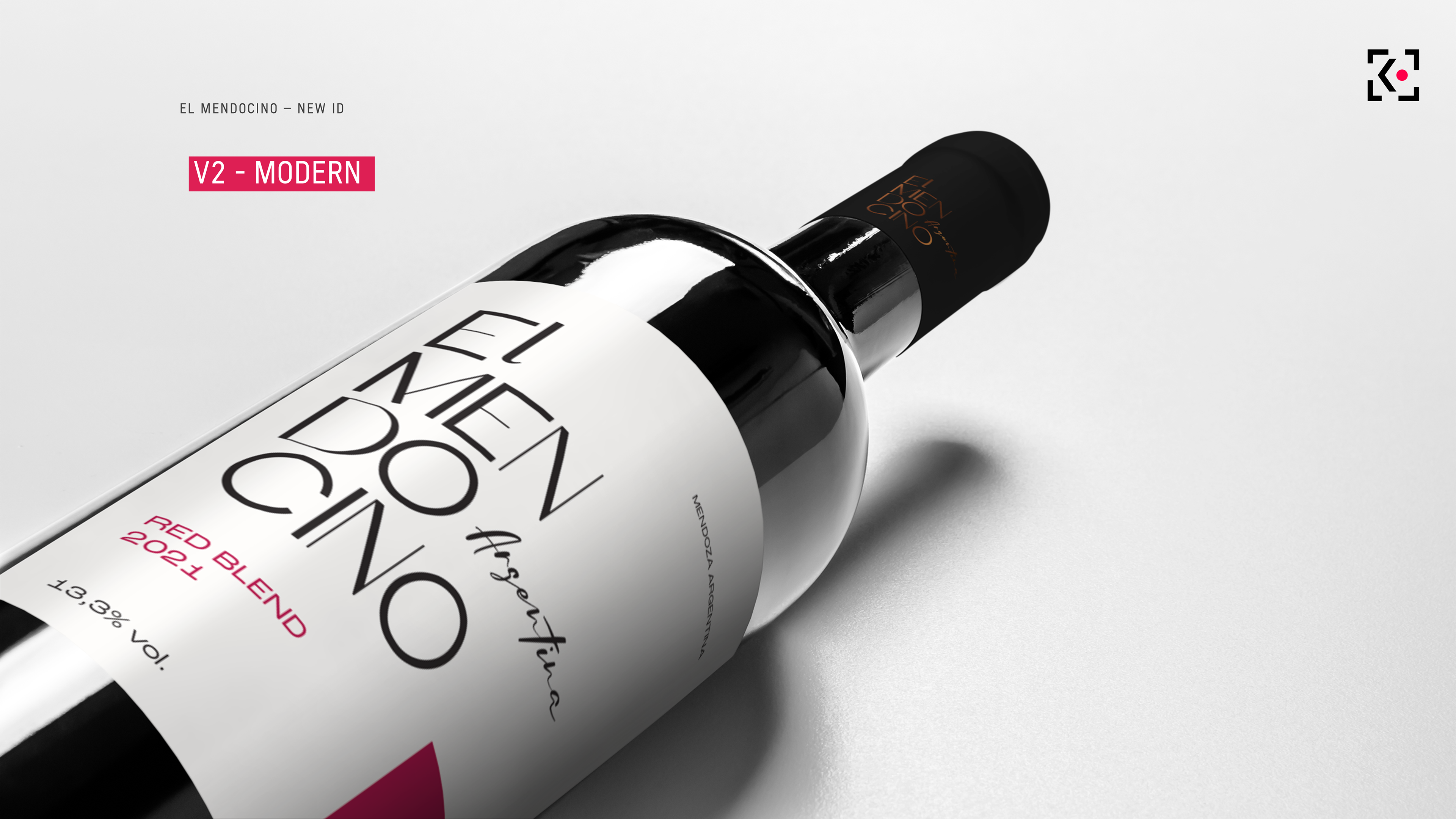
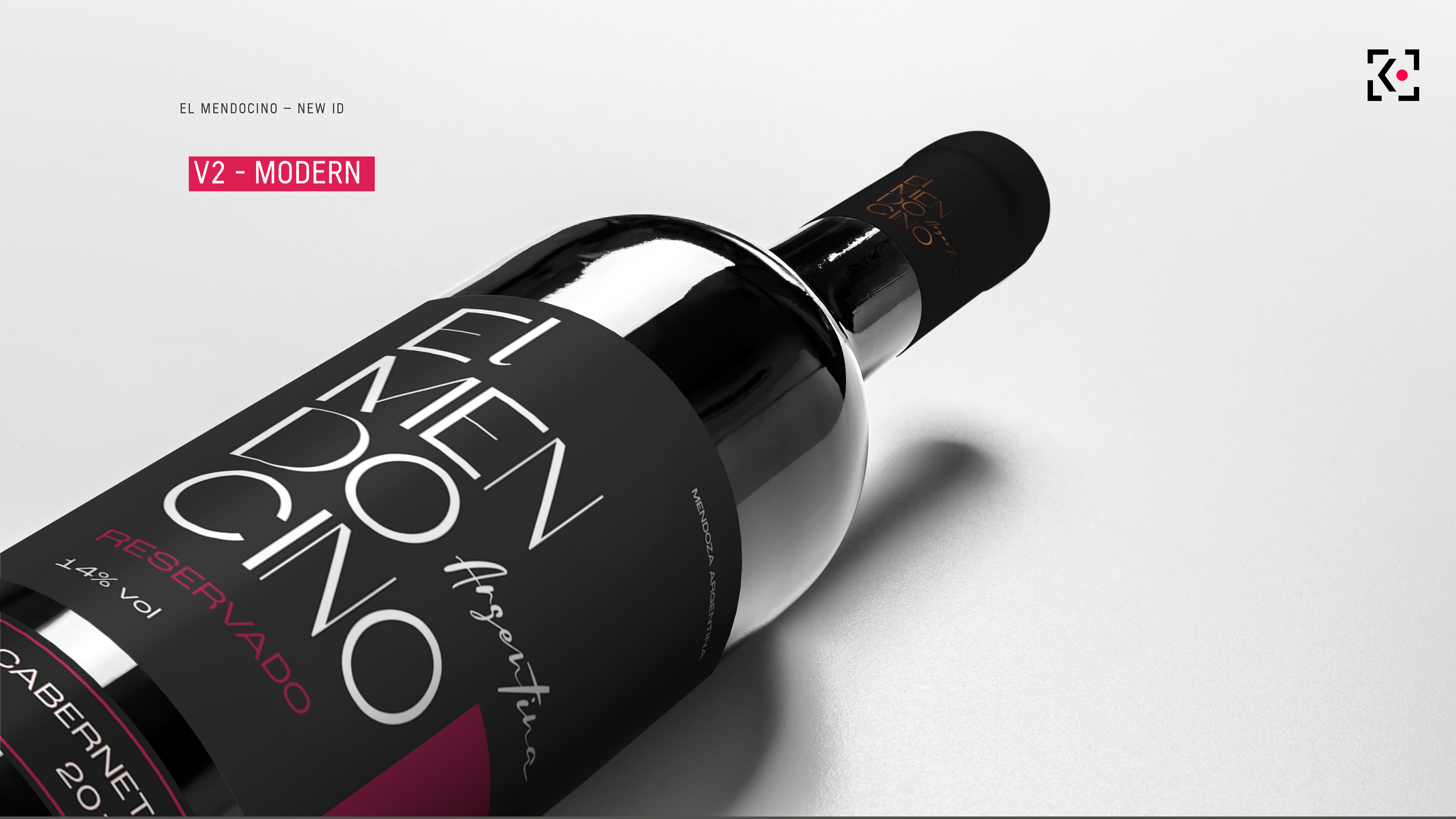
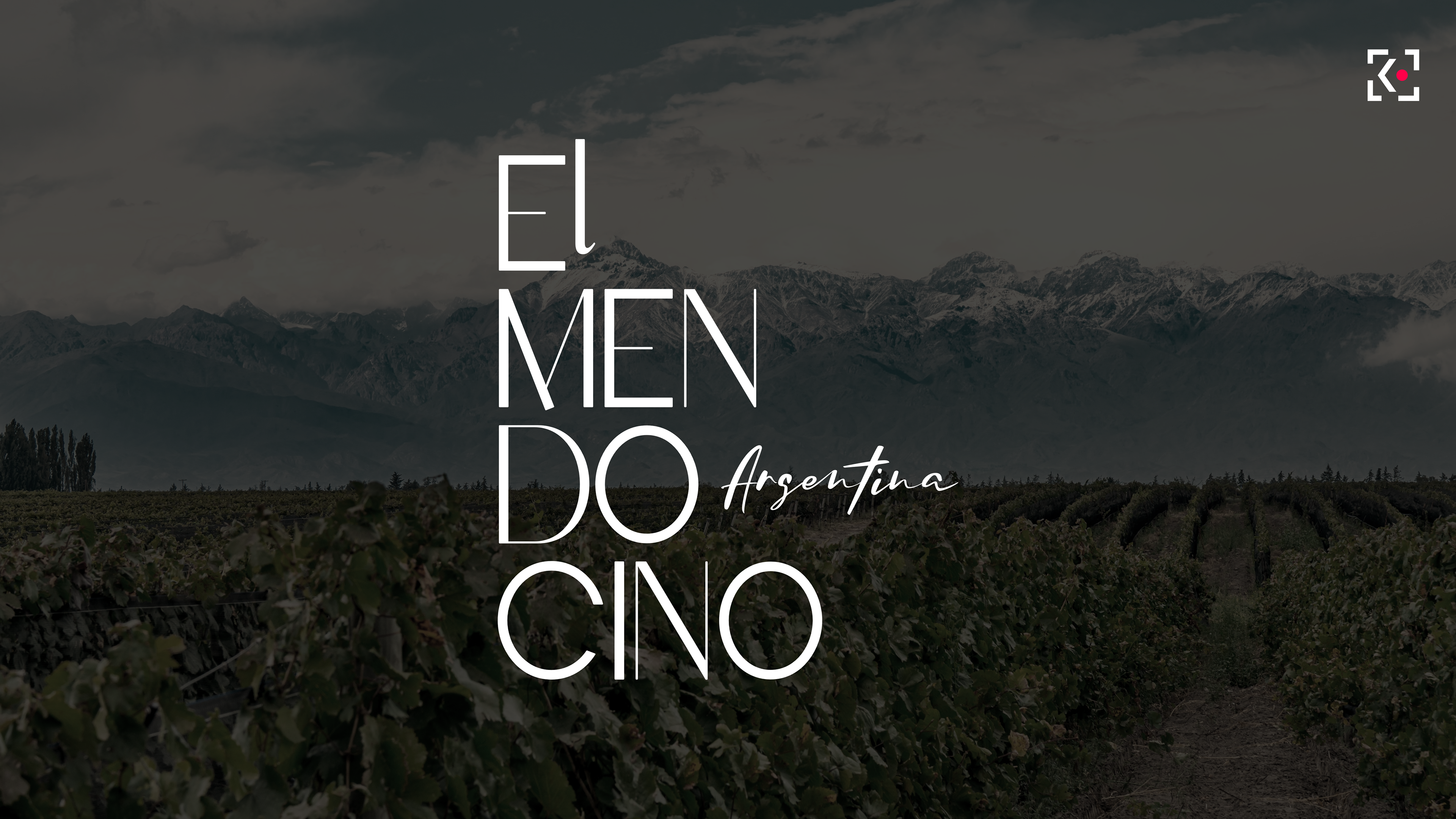
Both directions were developed as complete label systems for Red Blend and Cabernet Franc, combining brand redesign, packaging strategy and visual refinement to strengthen shelf impact and create a more distinctive product presence.
Thanks for watching!