

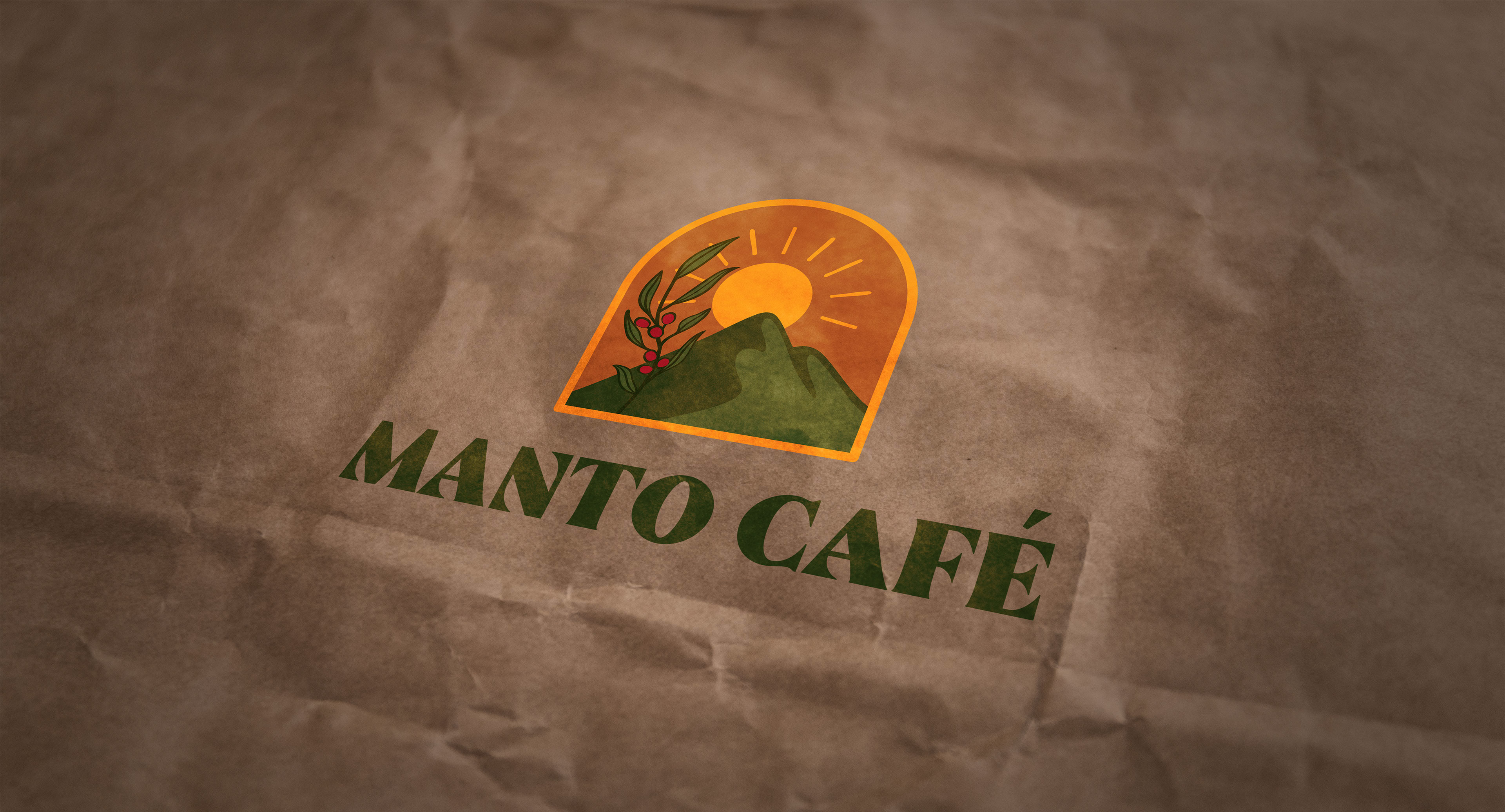
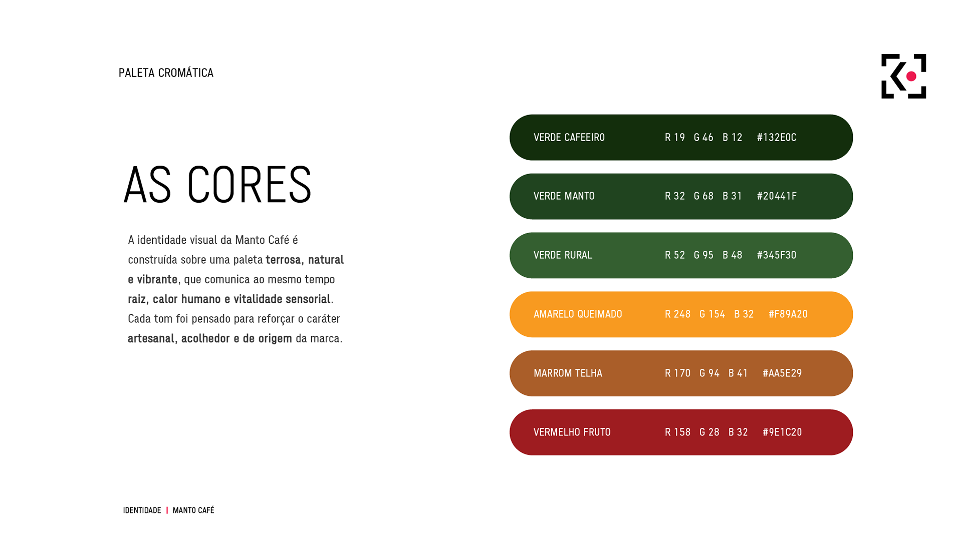
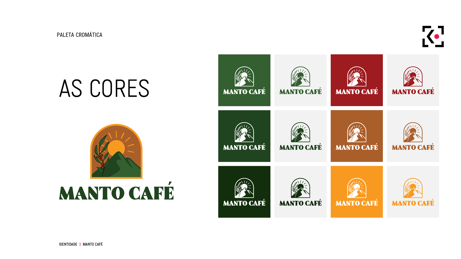
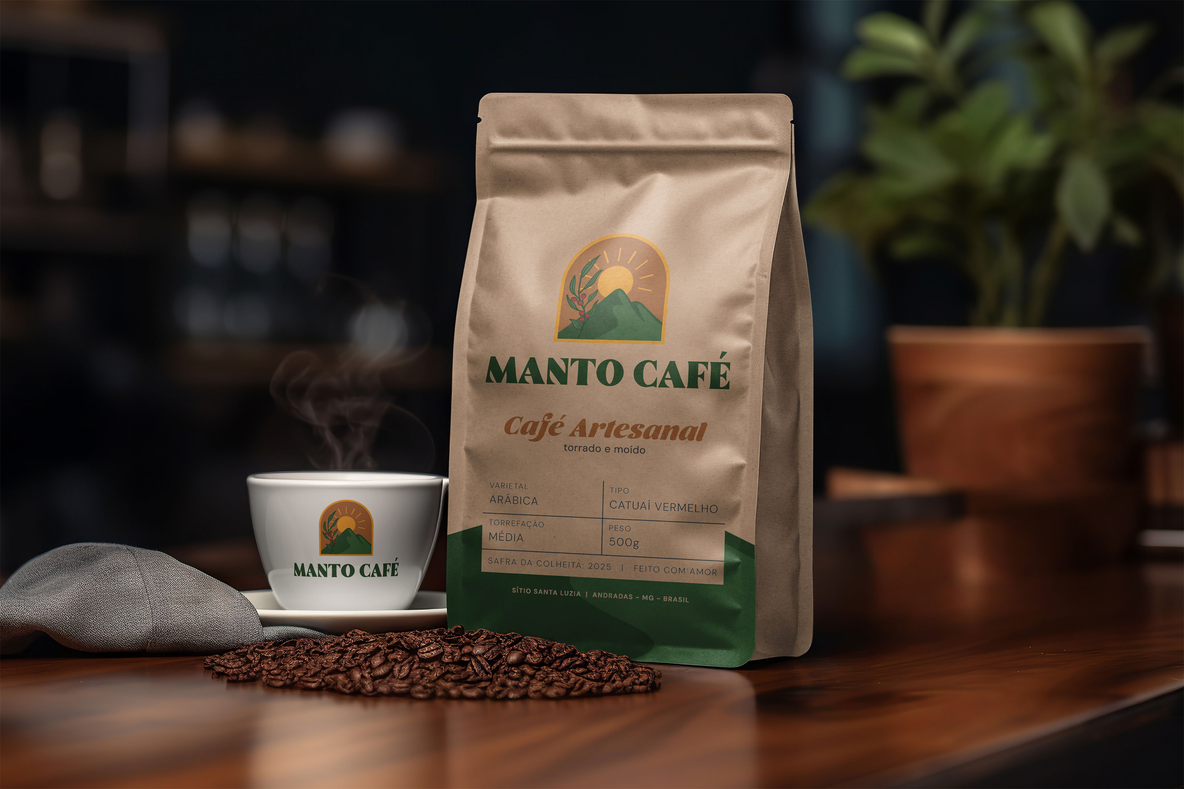
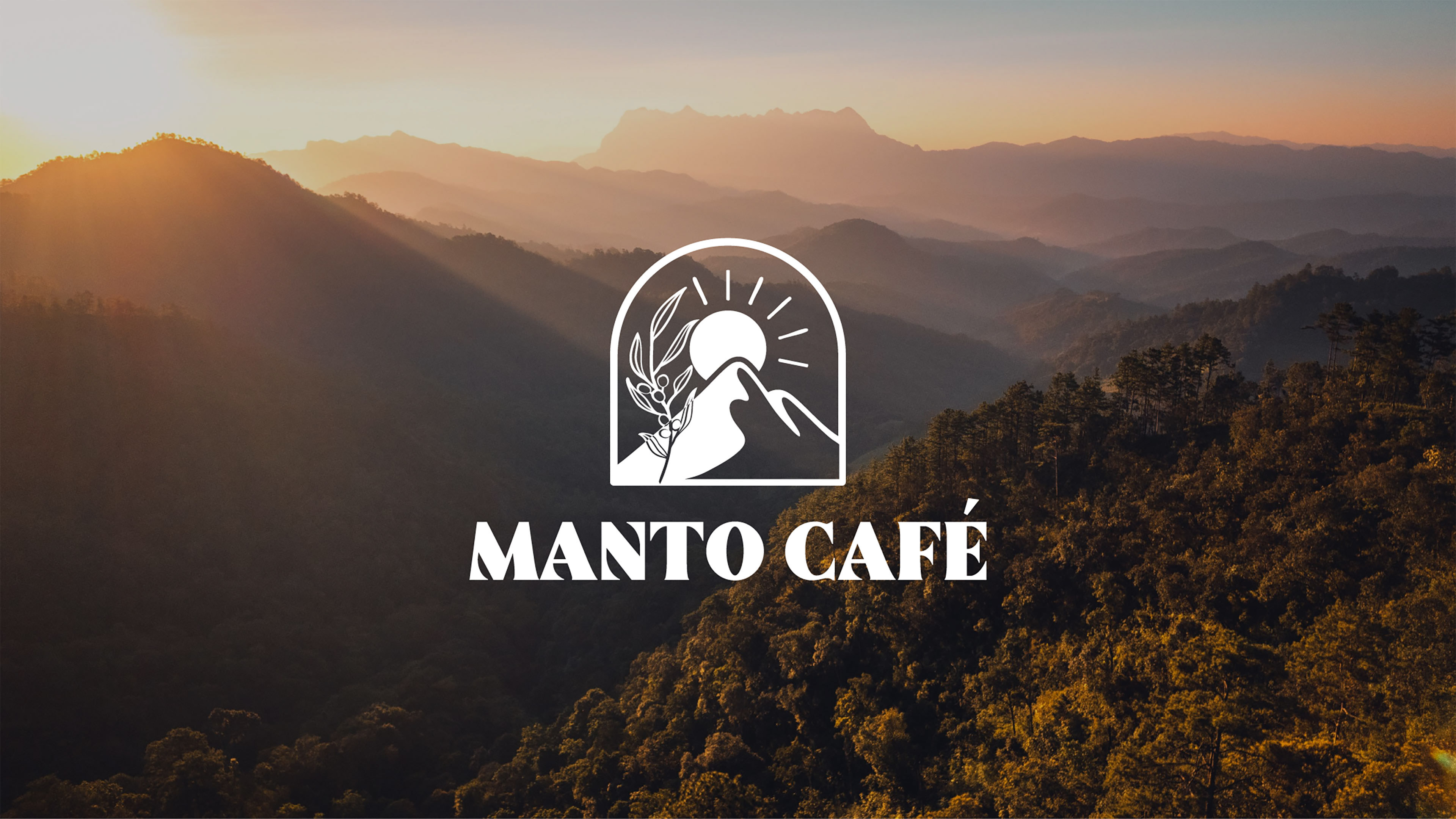
The name carries a subtle double meaning: it refers both to the mountain landscape of Mantiqueira, seen as a natural mantle, and to the mantle of Our Lady of Aparecida, a meaningful reference for the founders. The visual identity translates these layers through symbolic forms inspired by mountains, the mantle, the sun as light and crown, and the coffee branch.
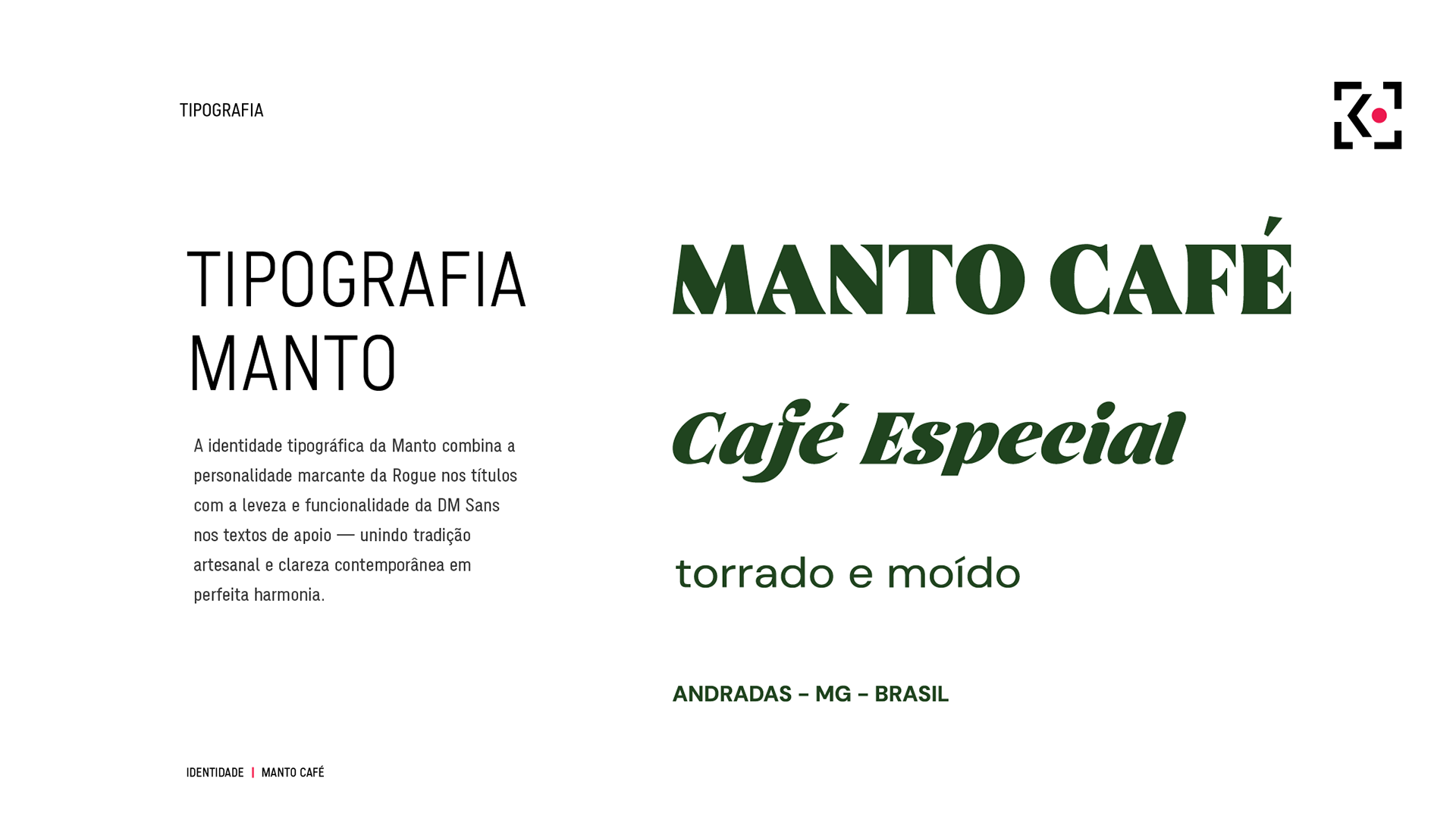
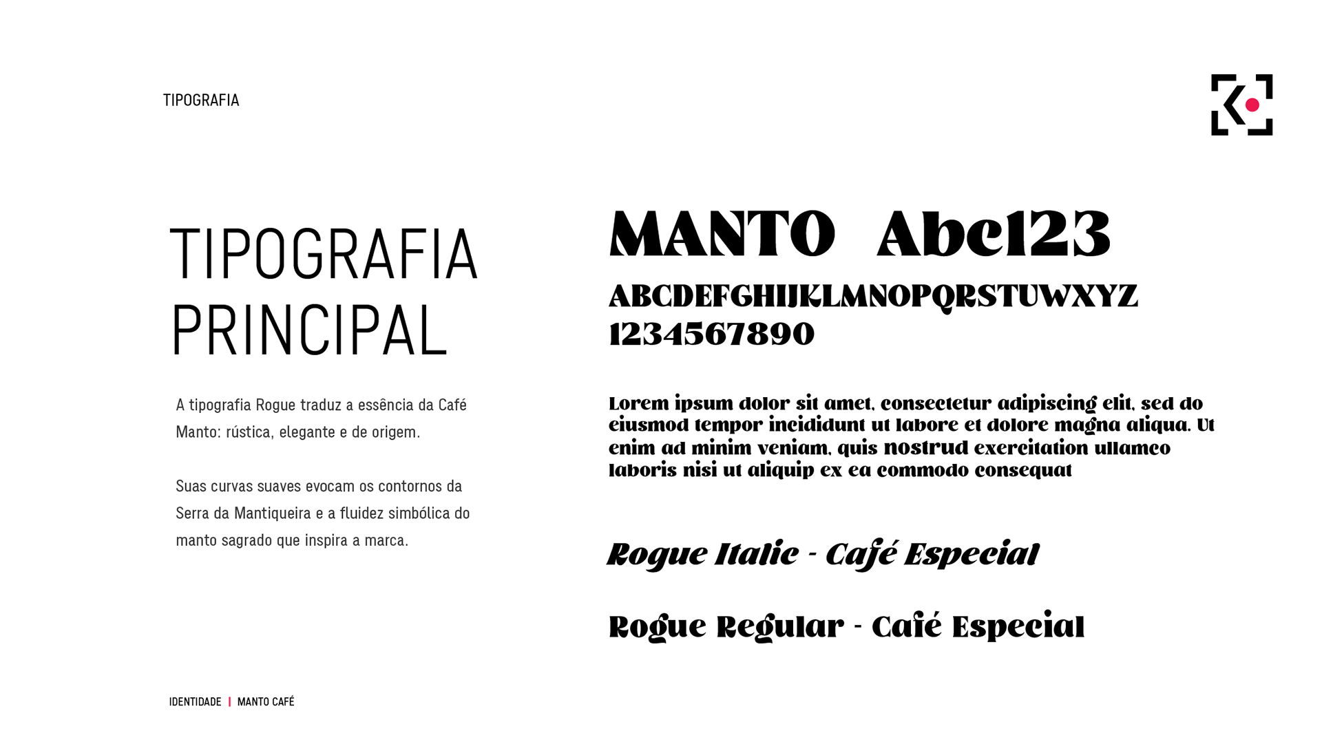
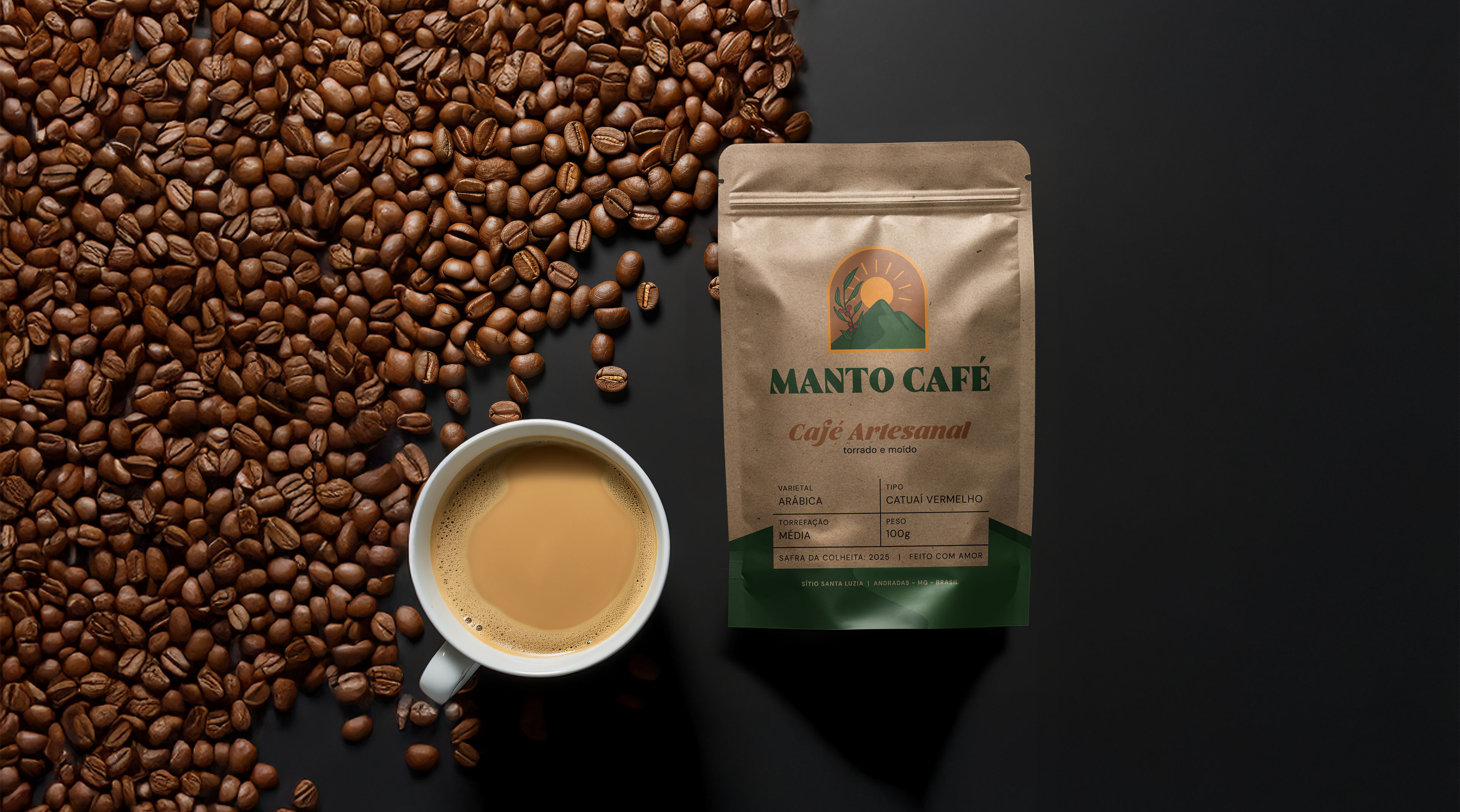
The challenge was to bring this spiritual and regional inspiration into the brand without making it religious or limiting its appeal, creating a packaging system with artisanal character, premium perception and strong shelf presence.
Thanks for watching!