

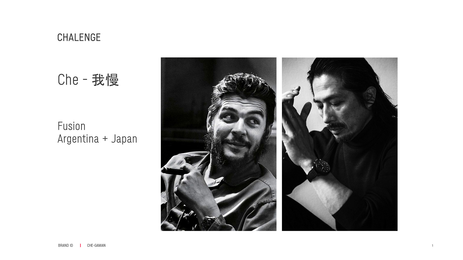
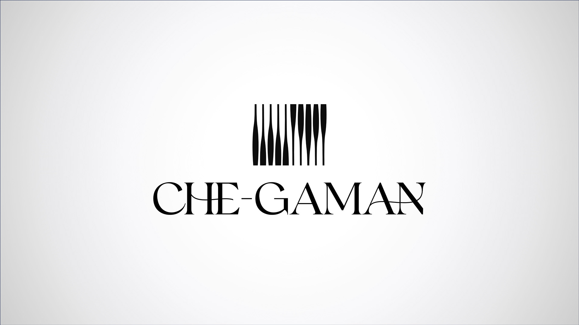
The Che-Gaman logo was created from the fusion of two distinct cultural universes: the Argentine tradition of wine and the Japanese sophistication of sake. The challenge was to design an elegant, versatile, and memorable identity for an importer of fine and exclusive beverages, capable of representing different labels, origins, and drinking rituals.
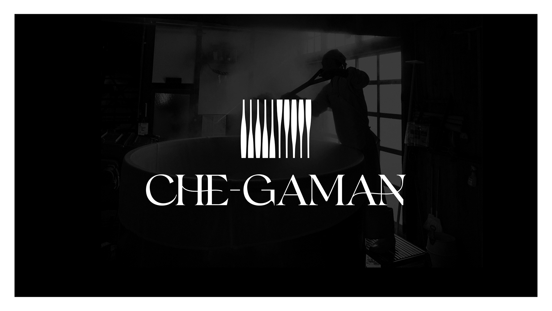
The symbol is built from parallel vertical forms that suggest different silhouettes of bottles and glasses. This simple yet expressive structure creates a refined mark that visually connects the ideas of curation, distribution, and tasting experiences.

The typography also reflects this cultural blend. Its design combines a sophisticated presence with subtle formal references that bring together the warmth of Latin culture and the precision of Japanese aesthetics, resulting in a contemporary identity with a distinctive personality.
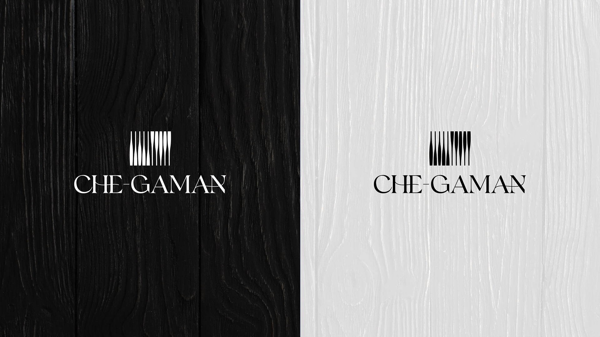
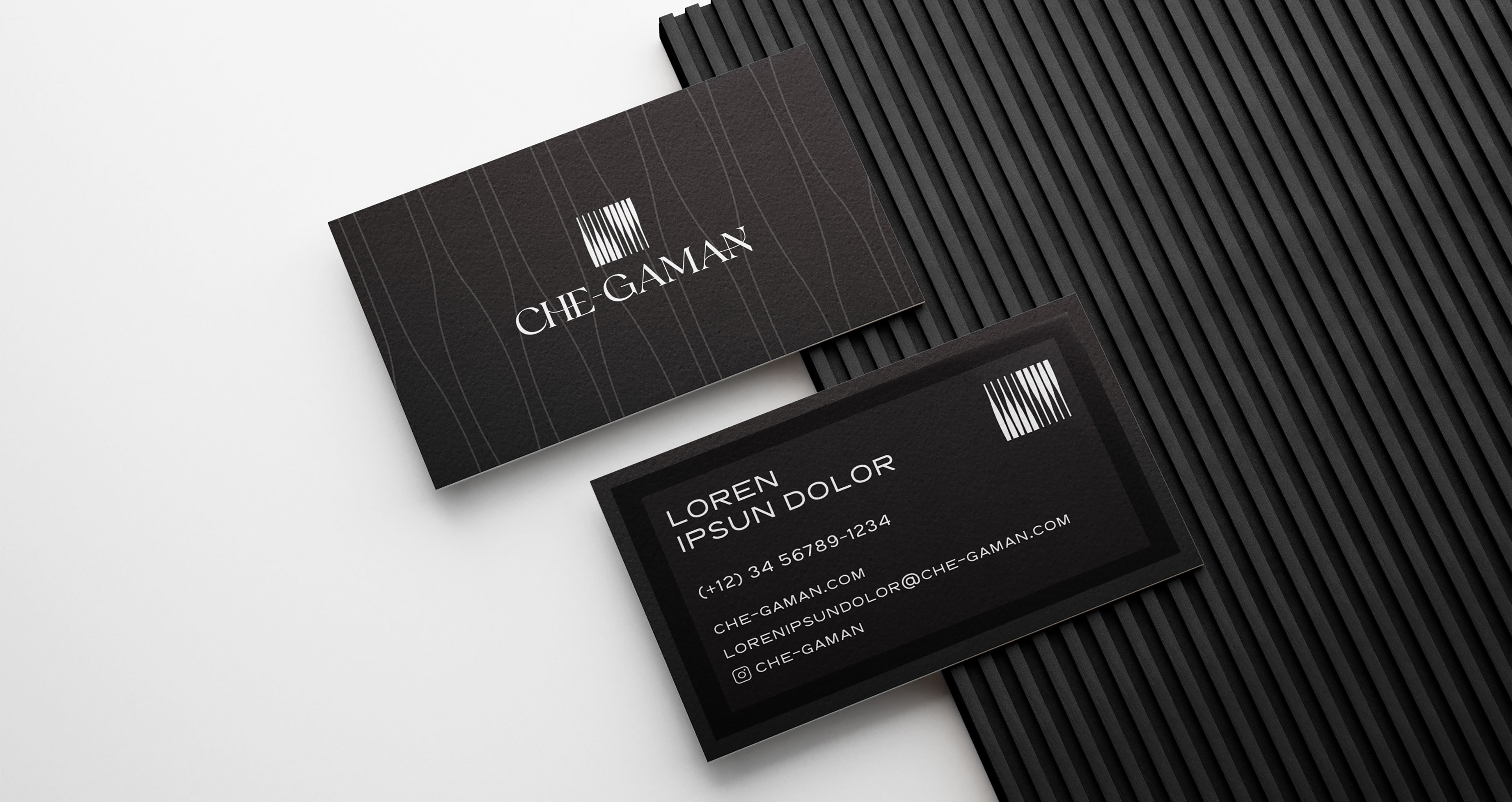
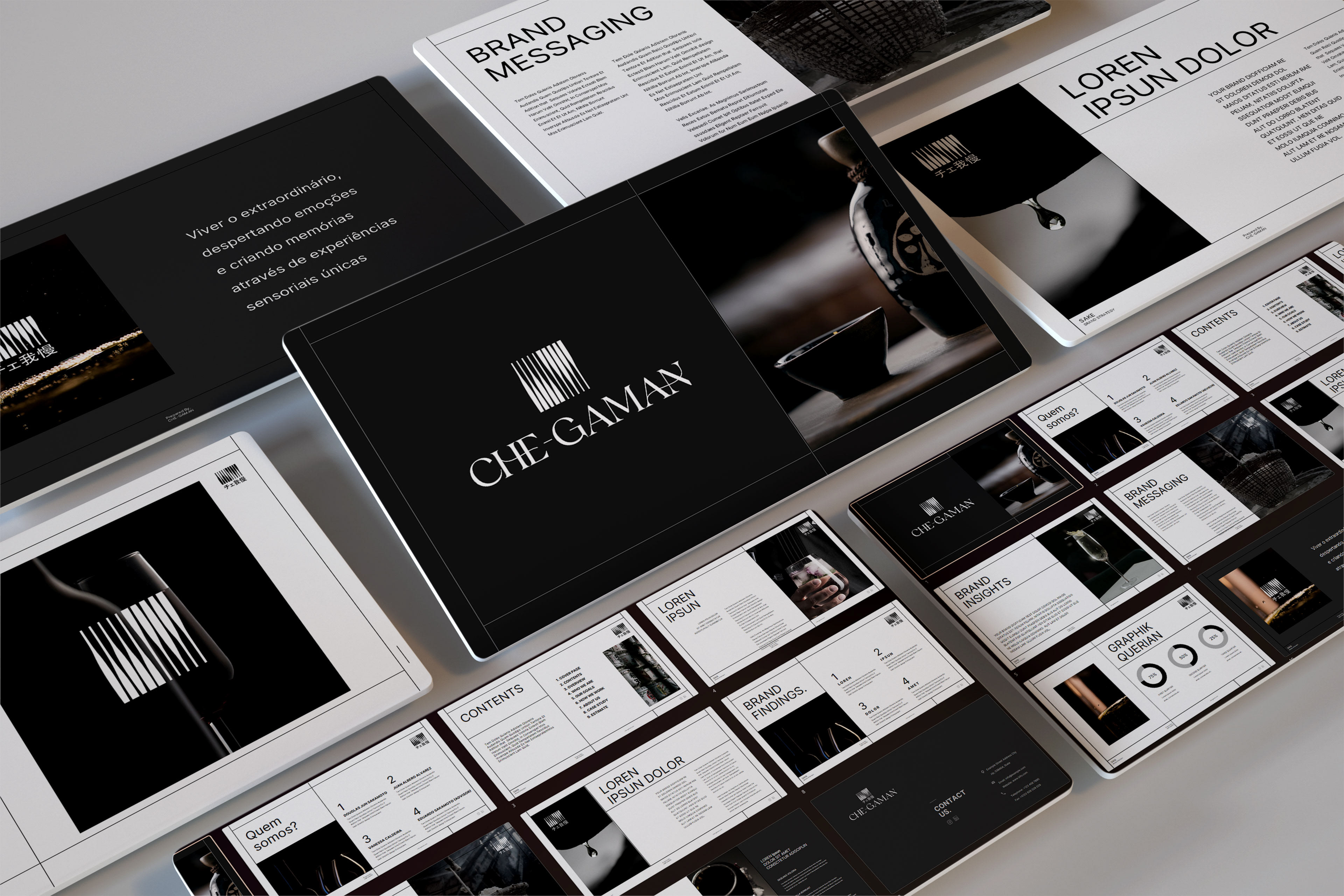
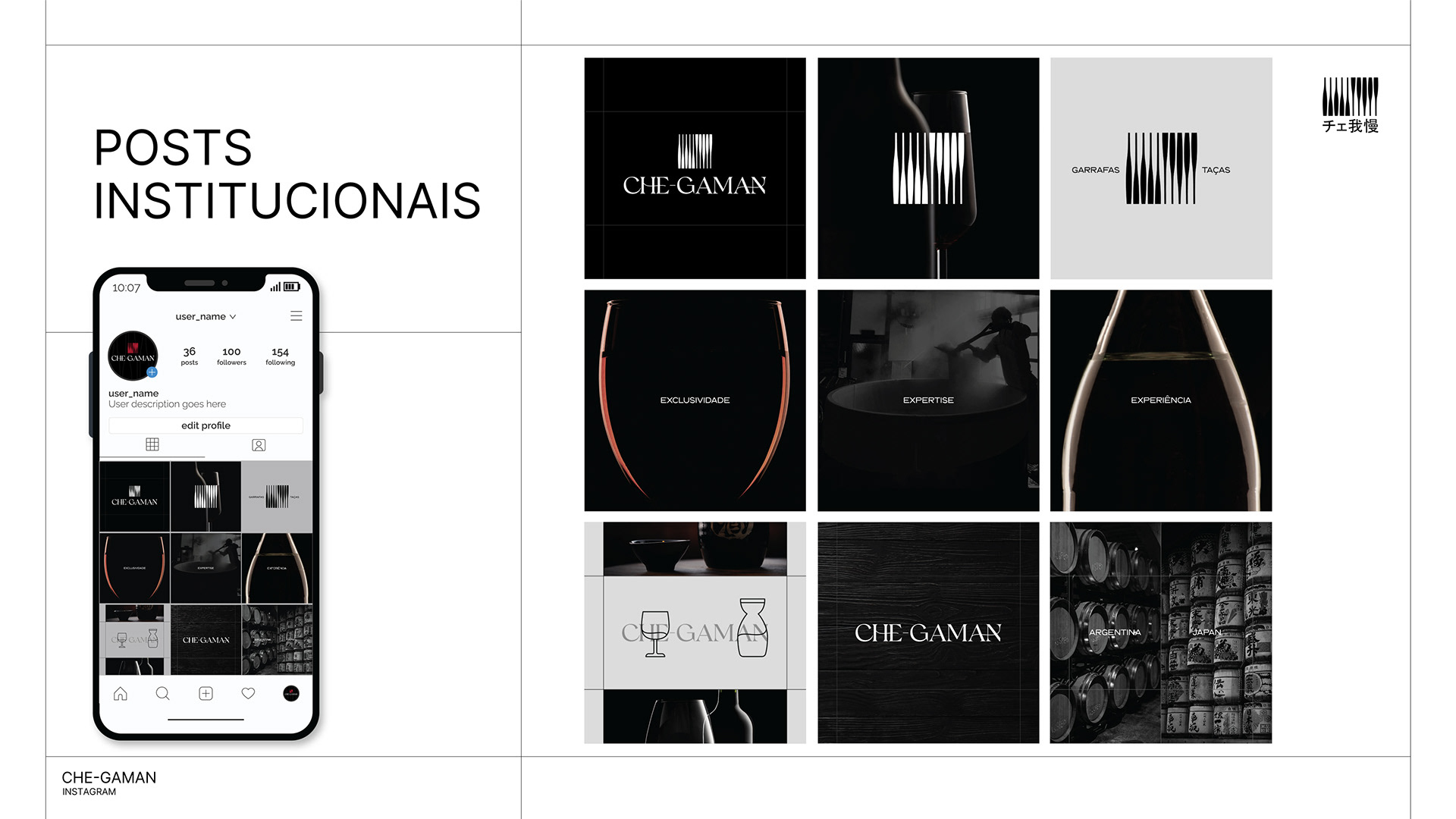
The project covered the full development of the brand identity system, including logo design, visual language, stationery, business cards, presentation template, and social media assets.
Thanks for watching!